
A compass rose, a coin, and a tiled basemap: three ways I spot ancient imperial seams in today's borders.
The coin-on-the-atlas trick for spotting imperial seams
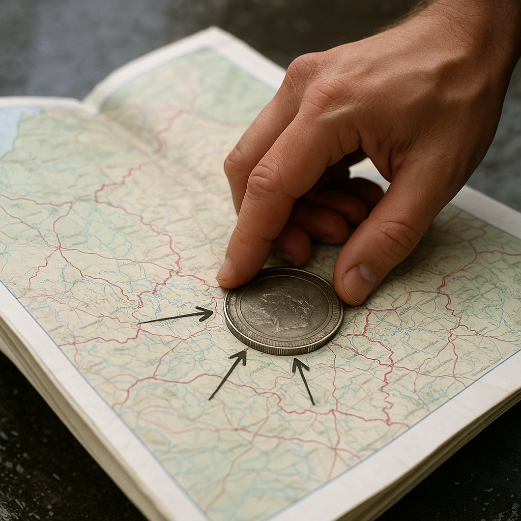
I learned this one on a rainy afternoon with a folding atlas that kept snapping shut on me. I put a coin on the page to hold it open, then realized the coin was doing something better than being a paperweight: it gave me a fixed circle to compare everything against. Pick a coin with a clear edge (a quarter works, but I like a big old souvenir coin because it has more rim). Drop it on the area you're trying to understand and use it like a viewing window. Inside that circle, ignore modern labels for a minute and look for the stuff empires left behind: long straight roads, ring roads around old garrison towns, and borders that kink when they hit an older administrative line.
On a good printed sheet, you can see the difference between a border that follows terrain and one that follows paperwork. Mountain borders cling to ridge crests, river borders meander, but imperial lines tend to jump between control points. You'll get a border that runs arrow-straight to a fortified town, jogs around it, then shoots off again toward the next hub. When I'm doing this on a modern screen map, I recreate the coin by dropping a circular measuring tool (radius set to 10 km or so) and sliding it around like a lens. The point isn't the exact distance. It's the repeatable frame that keeps you from cherry-picking.
Then I do one extra step that sounds fussy but saves time: I mark three features that feel "too organized" for the landscape. A dead-straight segment. A border that ignores a valley it could have used. A line that bulges to wrap a town. Those three marks are usually enough to tell whether I'm looking at an ancient empire's footprint (roads and nodes) versus a later national compromise (language pockets and voting districts). Once you see it, you start recognizing the same pattern in totally different places, even when the modern country names change.
Compass roses and the tell of an old survey grid
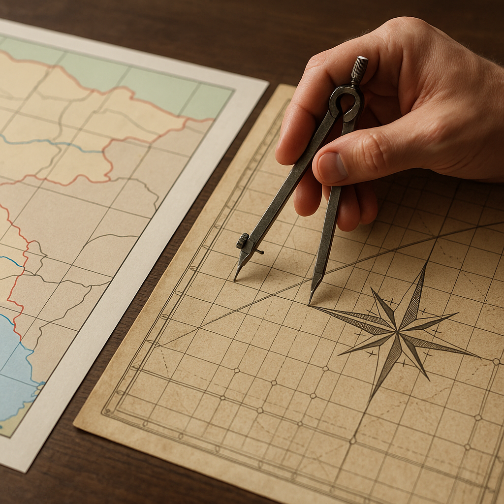
People treat compass roses like decoration until you start comparing sheets from different eras. An old imperial survey often has a quiet obsession with orientation and repeatability. You can feel it in the way the cartographer lays down a grid, the way roads snap to angles, and the way boundaries start behaving like they were drawn with a straightedge and a set square. When I'm trying to explain a weird modern border shape to myself, I look for the grid first, not the border. If a region has a visible survey logic, today's linework frequently inherits it, even if the empire that paid for the measuring is long gone.
Here's what I do at my desk. I pull up two layers side by side: a modern political map and an older scan with a visible graticule (latitude and longitude lines) or a cadastre-style layout. Then I rotate my attention away from the big labels and onto the tiny repeatable cues: mile markers, road alignments, and the angle of town blocks. If the old sheet has a strong north arrow and the settlement pattern lines up with it, you can often spot a seam where that measured world stops. Modern borders love to settle on that seam because it already existed as an administrative edge: tax districts, military jurisdictions, or land grants that were designed to be counted and governed.
The satisfying part is when the modern boundary looks wiggly up close but makes sense from a zoomed-out view. The line might weave around farms and villages, yet the overall direction still tracks the old survey's logic, like it's refusing to forget the original organizing principle. I noticed this most clearly in places where imperial infrastructure was the main event: straight roads connecting forts, planned towns, and parcels that look like they were stamped into the landscape. Once you train your eye on that, you stop asking, "Why is this border so messy?" and start asking, "What system is it protecting?" Sometimes it's a river crossing, sometimes it's a market town, and sometimes it's just a stubborn administrative habit that outlived the empire itself.
If you want a quick test without getting lost in research, use your map app's compass and rotate the view until one suspiciously straight border segment is perfectly horizontal. Now look at everything around it. Do other features snap into the same alignment? If yes, you're probably staring at an old measured framework that modern governments kept because it was already legible, already documented, and already enforceable.
Offline tiles, border stones, and the day the line made sense
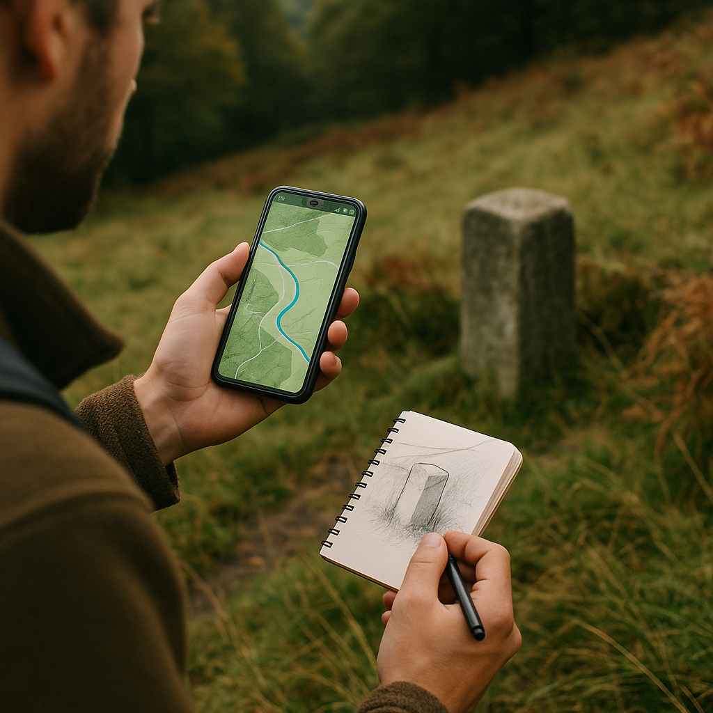
The most convincing explanation for a bizarre border shape I've ever gotten wasn't from a book. It was from a stone. I was hiking with offline tiles downloaded (because service in that valley comes and goes), and the blue dot kept flirting with a boundary that made no sense on the screen. It cut across a slope, skipped a stream that would have been an obvious divider, then curled around a patch of woods like it was protecting it. On the ground, there was an old border marker half-hidden in bracken, and that was the moment the map stopped being a graphic and started being a record of control.
If you're trying to connect ancient empires to modern borders, go find a marker, even if it's just a documented one you can reach on a short walk. Search for "boundary stone" or border marker plus the region name, then cross-check in your mapping app and save the area for offline use. The offline part matters more than people admit. When you're standing in a dip and your phone decides it can't load tiles, you start relying on whatever you saved, and you look harder at what the map is already telling you. Bring a small notebook and do a fast sketch of the immediate scene: where the marker sits, which direction the old roadbed runs (you can often spot a raised line or a suspiciously straight hedge), and what the land would have offered as a natural boundary that got ignored.
Ancient empires liked boundaries they could patrol and document. A marker set near a road junction or a ridge saddle isn't random, it's a decision about movement and enforcement. When you walk the line for even 15 minutes, you can feel why a later state might keep it. It's already in the paperwork. It's already in the locals' mental map. It's already a place you can point to with a finger. On my walk, the weird curl around the woods lined up with an old route that would have linked a fortification site to a river crossing. The border wasn't honoring the trees. It was honoring an imperial corridor that had been important long enough to harden into an administrative edge.
Back home, I pinned my sketch next to the screenshot of my offline map and the border shape suddenly looked less like a mistake and more like a fossil. Not a perfect one. Just recognizable if you know what you're looking at.