
Three map-reading moves that make colonial-era lines show up fast, from concession polygons to railway borders.
Concession outlines: the clean shapes that weren't drawn cleanly
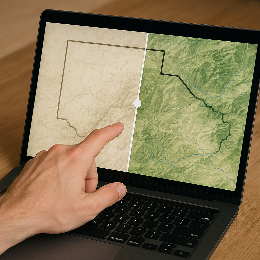
If you ever zoom in on a modern boundary and think, OK, that bit is suspiciously tidy, try this: stop looking for mountains and start looking for the ghost of a concession or charter. On a screen, those old administrative blocks have a particular look. They form long, confident arcs or hard corners that stay calm even when the terrain underneath is chaotic. I notice it most when I'm flipping between a historical layer (even a low-res scan) and a contemporary basemap, with the transparency slider doing the heavy lifting. The moment the shapes line up, you can almost feel the office stamp.
What makes this useful is that concessions were often described in a way that reads like a surveyor's checklist. Think bearings, rivers used as temporary edges, and straight segments that existed because they were easier to describe in a document than a messy watershed. When those blocks later hardened into international lines, the border kept the handwriting. If you're working in something like QGIS or even just a web viewer with a swipe tool, trace one of those clean segments for a few miles and look for three tells: (1) a sharp change in direction that doesn't match a ridge, (2) a persistent straightness across multiple drainages, and (3) a line that seems to ignore settlements that obviously belong together.
One practical move I use is to hunt for the old label rather than the old line. On many colonial-era sheets, the concession name is easier to spot than the boundary itself, especially when the scan is faded. Find the name, then follow the edge until you hit a corner. That corner often survives, even if everything around it has been renegotiated. It sounds nerdy, but it's fast, and once you see it, you start predicting where the odd modern jogs will be before you pan there.
Railway borders: when the track becomes the argument
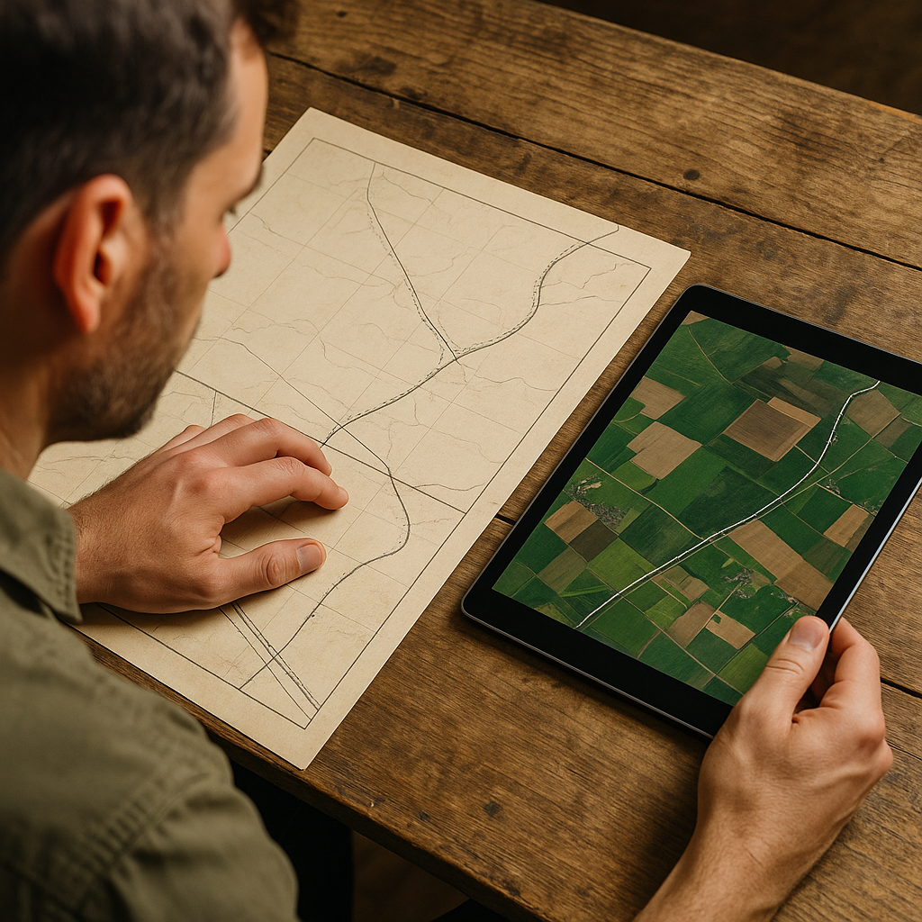
When a border seems to do something that makes no human sense, like tracking a corridor that slices between towns or refusing to straighten out across flat country, I check for a colonial rail plan. Not the tracks you ride today, necessarily. The earlier the plan, the more it reads like a promise made to investors, and those promises have a way of turning into boundaries later when everyone needs a line they can point to.
Railway influence shows up in a couple of specific map behaviors. The first is the parallel-problem: the boundary runs alongside a rail bed for a while, not directly on it, like someone agreed on a buffer that sounded reasonable in a meeting. You can catch this by turning on a transport layer and watching whether the separation stays weirdly consistent, even when roads wander. The second is the hinge: the line follows one corridor, then makes a crisp turn right where two routes would have met in a planned junction. I have found those hinges by looking at old railway maps that show proposed spurs in dashed ink. The spur never got built, but the negotiation that created it left a corner behind.
Here's how I work it when I'm not trying to write a dissertation, just trying to understand the shape. I pull up a historical railway map scan (the kind with hand-drawn sidings and mile posts), then I put it next to a modern satellite view. I don't care if the georeferencing is perfect. I'm looking for matching rhythms: a river crossing that forced a bridge, a straight stretch that only rail engineers would bother with, a station town that blooms on one sheet and is a dot on the other. Once I have one match, I follow the corridor and watch what the border does near it. If the boundary hugs the corridor through a stretch where a ridge would have provided a much cleaner divider, that's usually a clue that the rail right-of-way, or the politics around it, mattered more than the landscape.
And yes, sometimes the track came later and simply used the border because it was already surveyed. That's fine. The point is you can read the relationship. If the rail alignment is unusually straight but the border is the one doing the confident geometry, I put my money on the border coming first. If the border keeps darting to stay near the corridor, the corridor was probably the prize.
Mandate-era mosaics: the border that looks like it was cut with scissors
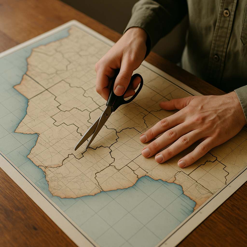
There's a specific kind of weird outline that doesn't read like conquest or like a river boundary. It reads like committee. Long before I had language for it, I used to call these “patchwork shapes” in my notes: borders that look like someone kept swapping pieces until the paperwork balanced. That's the feel you get in a lot of mandate-era and trusteeship transitions, where colonial administration districts, tax zones, and policing jurisdictions get promoted into international borders. When those districts were drawn for governance rather than identity, you end up with a modern outline that looks fussy at close zoom, then oddly purposeful when you step back.
What I do on a map when I see that scissors-cut edge is hunt for seam types. One seam is the coastline-plus-inland bite: a line that gives one side a thin coastal window, then compensates by bulking up inland. Another is the enclave echo, where a border jogs around a pocket that used to be a separate administrative unit, mission territory, or company-controlled area. You don't need to know the full backstory to spot it. You just need to recognize that you're not looking at a “natural” divider. You're looking at a ledger.
Practically, the best tool here isn't a clever trick. It's a boring layer stack. I like to bring up an old administrative map (districts, provinces, protectorates), then compare it to today's boundary at the same scale. The moment the modern outline starts following old district edges in chunks, the whole shape relaxes. Those little right-angle bites stop looking random because they're the corners of earlier units. If you can find a scan that still shows district names in big type, even better. Those labels tend to sit in the center of the unit, so you can work outward until you hit a boundary and see whether it matches today's line.
Two small, hands-on details from doing this over and over: first, the older sheets often use thicker ink for the major administrative boundary and thinner ink for internal ones. If a modern international line consistently matches the thicker ink, you're probably seeing the promoted border. Second, watch for roads that run straight to the boundary and then stop. That can be the afterimage of a colonial-era administrative road network that was never meant to connect across units. It's a tiny tell, but once you catch it, the shape stops being mysterious and starts being legible in the same way a city block grid becomes legible.